人文與社會

183 posts

「抄襲」還是「致敬」

「抄襲」還是「致敬」是一個在各個領域都會遇到的問題。抄襲的英文是plagiarism,致敬的英文是homage。放到實際的操作上來說其實兩者是一樣的概念:就是把別人做過的東西拿過來重做一次。抄襲不代表完全一模一樣;致敬也不僅是只有一點點像而已。每一個不同的領域對於抄襲和致敬的界線和接受度都不同。如果你去Google搜索「致敬」和「抄襲」這兩個關鍵詞,你會發現最多人討論的是電影裡的的致敬和抄襲。這不是我今天要討論的重點,我今天要討論在三個不同領域裡面對於致敬和抄襲的分界和判斷。

學術界的引用和抄襲

首先我們來談談學術界。抄襲是學術界的大禁忌。相信大家應該都聽說過某某大學校長因為被人發現以前發表的論文有抄襲的嫌疑而被除職的新聞。這種新聞一陣子就會出現一次,我想大家一定都覺得很奇怪。既然學術界大家都知道抄襲不可為,為什麼還有這麼多的學者會屢次的挑戰這個禁忌呢?這就要講到學術界的一個常見也常被誤解的觀念「引用文獻」。

根據學術界的共識,當你用了一個不是你自己發明的概念的時候,你一定要清楚的標明出來這個概念的出處,這就是所謂的「引用文獻」,英文叫做crediting sources。我相信任何讀過大學寫過研究報告的人都知道學術研究是站在巨人的肩膀上一步一步的向前邁進。沒有任何一個做學術研究的人可以完全靠著自己而不靠著前人的研究做出任何的成果。既然所有的研究都是建立在前人打下的基礎上,我們很自然的要把別人的功勞歸給別人,我想這一點不會有人有所質疑。問題出在引用多少的文獻是可以接受的?

舉例來說,有的學生在寫研究報告的時候會去網路上搜索是不是有人寫過類似題目的報告,通常都會找到至少好幾篇類似的報告。然後,這些略有小聰明的學生就會把這些網路上找來的報告剪貼剪貼然後重新拼湊成他們的報告。為了表示他們有遵守引用文獻的規定,這些學生還會正確的引用這些網路上蒐集來報告。如果你對引用文獻的認知是只要正確的提供文獻的來源和出處就可以了,那他們的確是做到了,但是這樣就夠了嗎?難道提供正確的引用文獻就不算抄襲了嗎?

答案是「錯」!

引用文獻是應該的,但是如果你過度的引用同一份文獻,那就成為抄襲。至於多少算是過度的引用在學術界並沒有一定的共識。重點是你在引用文獻的時候要小心,不要以為你只要提供了正確的文獻來源就沒有抄襲的問題。
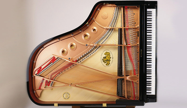
鋼琴的設計和抄襲

第二個我要討論的領域是鋼琴。鋼琴是一個非常複雜的樂器,而當今世界上至少有上百家製造鋼琴的公司。對於一個不懂鋼琴設計的人來說,每一台鋼琴看起來都是一樣:不管什麼牌子的鋼琴都有88個琴鍵,而且每一台鋼琴的琴鍵都是一模一樣。打開鋼琴的上蓋就會看到一個鐵的骨架,上面有很多不同長短的琴弦,另外還有擊槌…等等。基本上每一台鋼琴都有類似的零件,差只差在骨架的設計、每一條琴弦的長短和擊槌接觸的地方、以及其他很多細微一般人注意不到的地方。縱然如此,其實鋼琴的設計一直一來都是天下一大抄,大家抄來抄去,真正的差異其實很小。舉例來說,當初Yamaha開始製造三角鋼琴的時候就是把Steinway & Sons的設計抄來做小幅度的修改。這裡要再次提到Steinway這個家族對鋼琴界的貢獻。真的,今天世界上所有的鋼琴多多少少都有史坦威鋼琴的設計理念和影子在其中。甚至有的鋼琴公司大辣辣的在他們的官網上宣稱他們的鋼琴是完全仿製史坦威的(Brodmann PE-187就是複製的Steinway & Sons Model A,只是Brodmann比Steinway便宜很多)。這種事如果發生在學術界,這家複製鋼琴的公司早就被鞭笞至死了,但是在鋼琴製造業大家似乎早已見怪不怪。

手錶的致敬和假錶

最後來談談手錶。如果你對手錶稍有研究就會發現市面上的手錶很多都長的很像,甚至一模一樣。舉例來說,這篇文章開頭的那張照片中間的手錶是Rolex Submariner,旁邊兩支則是別的公司生產的。Rolex Submariner是勞力士在1953年推出的手錶。1962年美國好萊塢推出了一部名為Dr. No的電影,電影的男主角由一位出道好一陣子但是不太紅的年輕英國演員飾演一位英俊瀟灑又風流惆悵的英國情報員,而他的配錶正是這支Rolex Submariner。當然,我想大家都知道這位演員的名字叫做史恩康納萊 Sean Connery而他飾演的角色正是史上最出名的電影情報員007 詹姆士·龐德 James Bond。Rolex Submariner想當然一夜之間成為全世界所有男人夢寐以求的手錶,剩下的歷史我想就不用說了。

Rolex Submariner作為007的配錶和上層社會的一個表徵,它的售價可不是一般人買的起的。一支新的Rolex Submariner至少要美金$7,000(約合台幣20萬),美國和歐洲的有錢人不像台灣中國這麼多,因此就有很多公司生產了長的像Rolex Submariner的手錶來向勞力士「致敬」。其實所謂的致敬就是抄襲,長的一模一樣,一看就知道是從哪裡抄過來的。但是在手錶界,只要你不要連品牌名稱都抄襲,其他的你要怎麼抄基本上是沒有人管你的。如果你把品牌名稱也一起抄了,那就成了假錶,是會被警察抓的。只要你不要在你生產的手錶上放上Rolex的名字和商標,你要怎麼樣都可以。於是,市場上便充斥著各種向Rolex Submariner或是其他有名的手錶致敬的產品。

總之,抄襲和致敬的界線在各個領域是不同的,而各個領域對於抄襲的接受度也是不同的。

Skyfall

This is the end
Hold your breath and count to ten
Feel the earth move and then
Hear my heart burst again

For this is the end
I’ve drowned and dreamt this moment
So overdue I owe them
Swept away, I’m stolen

Let the sky fall
When it crumbles
We will stand tall
Face it all together

Let the sky fall
When it crumbles
We will stand tall
Face it all together
At skyfall
That skyfall

Skyfall is where we start
A thousand miles and poles apart
Where worlds collide and days are dark
You may have my number, you can take my name
But you’ll never have my heart

Let the sky fall (let the sky fall)
When it crumbles (when it crumbles)
We will stand tall (we will stand tall)
Face it all together

Let the sky fall (let the sky fall)
When it crumbles (when it crumbles)
We will stand tall (we will stand tall)
Face it all together
At skyfall

(Let the sky fall
When it crumbles
We will stand tall)

Where you go I go
What you see I see
I know I’d never be me
Without the security
Of your loving arms
Keeping me from harm
Put your hand in my hand
And we’ll stand

Let the sky fall (let the sky fall)
When it crumbles (when it crumbles)
We will stand tall (we will stand tall)
Face it all together

Let the sky fall (let the sky fall)
When it crumbles (when it crumbles)
We will stand tall (we will stand tall)
Face it all together
At skyfall

Let the sky fall
We will stand tall
At skyfall
Oh-s…

Written by Paul Epworth, Adele Adkins

Yes, that’s how I feel right now.

Calluna font

Calluna fontAs a professor and a coordinator for an academic unit in a state university, I often have to produce documents that must exist in different formats. For example, my class syllabus in available online in PDF format but I also need to print it out and pass to students in the first class. Other examples include student handbook, program information sheets, and many other documents. They all need to look good on-screen as PDF files and in print.

As someone who cares a lot about typography, I am in constant search of good text fonts. Because the documents I produced tend to be very text heavy, I want a good-looking text font that can perform well in small font size. For my purpose, I need the font to meet the following criteria:

  1. The font must look formal and authoritative. Because the documents I produce are official university documents, I need them to look official and authoritative. Therefore, anything that looks fun and funny are out.
  2. I want a font that does not look boring. If the first criterion is the only criterion, I can just use pre-installed Windows PC fonts such as Times New Roman, Arial, or Cambria. Many people have done that and I have no objection on their choice. From my point of view, however, all those pre-installed fonts are overused and boring. I want a font that has some flare and more details but not outrageous. For example, even though I like Berkeley Oldstyle a lot, it to me has too much flare and decorations for a text font.
  3. I want a font that is not too expensive. I have a limited budget, so free would be my preference. If I have to buy the font, I want something that is not too expensive.

I have tried many different fonts and eventually I settled with two fonts: Adobe Minion and Calluna.

Minion fontAdobe Minion is a good-looking font and it looks very format and authoritative. The only problem is that it does not look very unique. It is true that in a quick glance most people would probably mistaken Adobe Minion for Times New Roman. However, I find Minion better looking than Times New Roman. The good thing about Minion is that its size is almost identical to Times New Roman, so you can replace Times New Roman with minimum changes to the overall layout.

Calluna is my new favorite text font. Its regular font is free to download. Calluna has a larger x-height thus make it easier to read in small font size compared to other popular text fonts such as Garamond. However, Calluna’s x-height is not too large as fonts aimed for screen reading. Many screen-reading-friendly fonts tend to look awkward in print because the x-height is too large. Calluna hits a very nice balance between screen reading friendly and looking good on paper. Calluna also has more details and flares that makes it look more distinguishable than fonts such as Minion and Times New Roman.

If you are looking for a text font and you have never tried Calluna, you should definitely give it a try.


My Research Focus

InterdisciplinaryToday I thought about a new way to describe my research focus:

My research focus is the study of college impacts and institutional effectiveness through an interdisciplinary approach.

When I say college impacts, I mean student learning in- and out-of-classrooms, online education, STEM education, student engagement, civic engagement, and moral and spiritual development of college students.

When I say institutional effectiveness, I mean assessment of student affairs practices, teaching evaluation, student satisfaction, and other measures of institutional competitiveness and effectiveness.

Many scholars study college impacts and institutional effectiveness, but my unique contributions come from the utilization of an interdisciplinary approach. I investigate college impacts and institutional effectiveness through psychological, sociological, and economic theories combining with the current literature in the field of education, business management, data sciences, and leadership.

雨天

Raining Day來美國這麼多年,我已經很習慣美國人做事的方法。但是有一些事情我到今天還是不能理解。其中一點是美國人對於淋雨的態度。

今天外面下著不小的雨,是那種大概在雨裡待個一分鐘就會全身濕透的那種。早上當我從停車場走到辦公室的路上我卻發現在校園裡面走的人大概只有三分之一打著雨傘。有另外三分之一穿著有帽子的外套(但是不是雨衣),還有三分之一的人就這樣淋著雨在路上走。奇怪的是這個雨已經下了兩天,所以這些人出門的時候早就知道外面下著雨,但是他們寧可淋雨也不打個雨傘或是穿個雨衣。這到底是怎麼樣的做事邏輯,我真的很不懂。